top of page
Toy + Gift
Return Home
LinkedIn
Email

TOY + GIFT

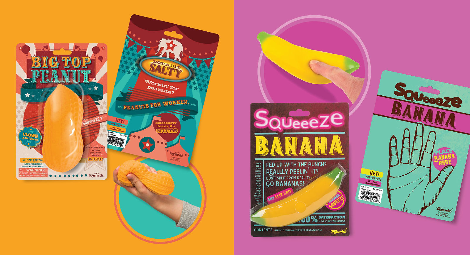
Oh, trends, how I know thy name! Toysmith curated and produced a line of gift products aimed at adults featuring light bathroom humor, nostalgia, and fidget fun. The packaging design was meant to be full of visual and wordy trendiness to bring a smile to the face of working adults! Behind the scenes, I happily researched and brainstormed lists of buzzwords, punny phrases, and the general vernacular to assign to the items they best suited.

Buzzword Pen Packaging

Click your way to success with the buzzword pen's handy one liners ready for the latest meeting. 

Buzzword Pen Packaging

SHOWER NOTES PACKAGING

Notes in the shower have never been easier- grab a crayon and transport back to childhood before facing the adulthood of the work day.

Shower Notes Packaging
Shower Notes Packaging Die Line

Die Line

NAMASTAY STRESSED PACKAGING

Chase the stress away one squeeze at a time with these handy stress balls that understand and even label your pain.

Namastay Stressed Packaging

Catstronaut packaging

Cats in space! It's been a thing. A squishy, squeeze feline friend to pop into a bag or sit upon a desk anytime. 

TS 7752 Catstronaut_FOLIO-01.png

BIG TOP PEANUT PACKAGING

Toysmith went through an all things delightfully squishy phase, enter this ginormous circus peanut. Coordinating the themed packaging to support that classic candy peanut color was key. 

Big Top Peanut Packaging

Squeeze Banana Packaging

This was a bunch of fun creating the copy as well as the design which was an ode to the Electric Banana, a punk rock music venue from decades ago.

Squeeze Banana Packaging

THe Write Lightbox Packaging

This trendy little Lightbox lent itself well to a brightly colored pop art treatment. 

The Write Lightbox Packaging
The Write Lightbox Packaging Die Line

Die Line

Don't Worry Be Happy Squishy Sloths Packaging

Sloths were quite the popular animal in recent years, and no doubt they knew it with their racing to get to the finish line. The price point allowed for a little extra fun with a pop out finish line insert. 

Don't Hurry Be Happy Sloths Packaging

The "Family Look" Challenge

The trouble with branding can be that it'll often take away some of the individuality and FUN of the item if each and every package carries the same copypaste-style.


SOLUTION: PROVIDE VISUAL VARIETY TO ENLIVEN PRODUCT INTEREST 

To bring a collection of items together with similarities such as the penguins below, I devised a system where a select number of typefaces, most often three, along with a color palette and sometimes a pattern or texture were gathered into a "family look," wherein the other team designers had freedom to employ the design elements as wanted to the packaging. When viewed collectively, the items retained a commonality 
that looked polished on the shelf. 

RESULTS 

Sales and customer service feedback reported the packaging a hit, bringing in revenue and verbal praise collectively inside and outside the company

Penguins Family Look Packaging

CREDITS
Designer - Deborah Davis
Designer - Julie Jennings
Photographer -
Jim Palmer

© 2024 DEBORAH DAVIS
LinkedIn
Email
bottom of page